I’ve started wrestling with the cover art for WAR OF MAGIC. I’ve had the image finalized for quite a while.

It’s very nearly perfect, but there’s just one problem with it. All the other books in the series use white text. And white just doesn’t show up well on this background.
So I’ve been experimenting with options.
I tried black text. It’s not bad, but it doesn’t show up real well, either.
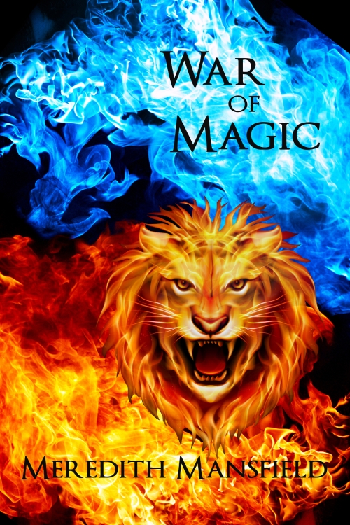
(This one isn’t finished, of course. It still needs the “Dual Magics Book 4” somewhere. Most of these do.)
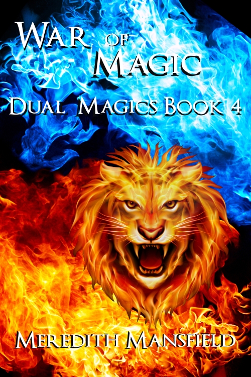
I tried to use solid bands.

This works, but it has the disadvantage that I’d probably have to change all the other covers to match–and I like them better as they are.
I tried a mix.

I tried clearing part of the background.

And I tried a drop shadow.
So far, most of the people I’ve asked like the bands best. But I don’t.
Well, we’ll see.


The easiest to read, for me, are the banded and the drop shadows . The shadows help a lot.
LikeLike
I’m leaning toward the drop shadows. Unless I can come up with another clever idea. There’s time.
LikeLike
Can you do something like black letters with a white outline to make them stand out more?
LikeLike
Possibly.
LikeLike