Today, I decided to talk about cover art, because, I don’t know, some of you may be thinking about e-publishing or just starting to and wonder about cover art.
Now, I’m currently forced to do this on a shoestring budget, so I make my own cover art. I’ll confess, my first covers were dreadful. Awful. And it does make a difference. Here’s my very first cover for the Novelette “Heart of Oak”:

Now, this isn’t my worst cover, but it’s pretty bad. It’s actually from a photograph I took several years ago.
Look at it in gray scale:

I didn’t realize at the time that you have to worry about that too. A lot of e-readers are still black and white. (Mine is.) This is what the cover looks like on those readers. Make it as small as a postage stamp too and even the color version is just shades of green.
Here’s the current cover:

So much better. Isn’t that image just about perfect? Here’s what I did.
There are a lot of sites out there that allow you to purchase the right to use art–photographs and other images. I like Dreamstime, mostly because I have better luck finding what I’m looking for there. Also because the licensing agreement specifically says the images can be used for book covers. That background image cost approximately $13. For that, I purchased the right to use it 10,000 times.
Again, I’m working on a shoestring here, so I use GIMP (a free download image manipulation program) for the titles, etc. It doesn’t have all the bells and whistles of say, PhotoShop. I can’t easily do drop shadows on the text, for example. But it does everything I need, if not everything I might wish for.
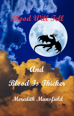
Occasionally, I do a few other manipulations with the background image, like adding the dragon silhouettes to the covers of BLOOD WILL TELL and BLOOD IS THICKER. The background image for BLOOD WILL TELL was landscape orientation. I had to rotate it to make it work for a book cover, but that’s easy. The right to use the background image for BLOOD WILL TELL cost approximately $17.

I had a couple of false starts on the cover for BLOOD IS THICKER. I purchased images that I ultimately didn’t use before I found the right one, partly because I’d let myself get focused on one idea and only looked for images that fit that idea. (I wanted to use magical skies as the backdrops. What’s more magical than an aurora?) You have to open yourself up to other possibilities. Who knows? I might find a use for those images, later.
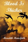
That yellow sky is pretty magical, too. And I knew it would work for the silhouettes because there was another photo in the same group with geese in silhouette.
My favorite cover so far, hands down, is for the combined edition. After a couple of false starts, I figured out how to clip the cloud images from the background for the BLOOD IS THICKER COVER and overlay them on the background for the BLOOD WILL TELL cover. Then it was just add the dragon silhouette and the titles. But the deep blue and gold skies are so striking together.
Isn’t that a huge improvement over that first “Heart of Oak” cover?
So that’s how I do it.


It’s been fun to see how you’ve developed your covers. Covers can make or break a book so they’re so important.
LikeLike
Thanks. It’s been an interesting journey. Like anything else, the main thing is to keep getting better at it. 🙂
LikeLike
[…] Cover Art (meredithmansfield.wordpress.com) […]
LikeLike